Client:
Travel
Portland
SERVICE: Branding
YEAR: 2019-2020
—
CREATIVE DIRECTOR:
Brett Simon
ART DIRECTORS:
Sarah Hollowood
& Karen Koch
DESIGNER:
Raina Jung
Travel
Portland
SERVICE: Branding
YEAR: 2019-2020
—
CREATIVE DIRECTOR:
Brett Simon
ART DIRECTORS:
Sarah Hollowood
& Karen Koch
DESIGNER:
Raina Jung
Even as Portland evolves, it will always be a place that welcomes different ideas and visitors from all walks of life. Locals are independent free thinkers who thrive on change. This gives the city its vibrancy, unique culture, and “only-in-Portland” neighborhoods. This identity system helps bring this spirit to life in a way that is true to Portland and unique among destination marketing organizations (DMOs).
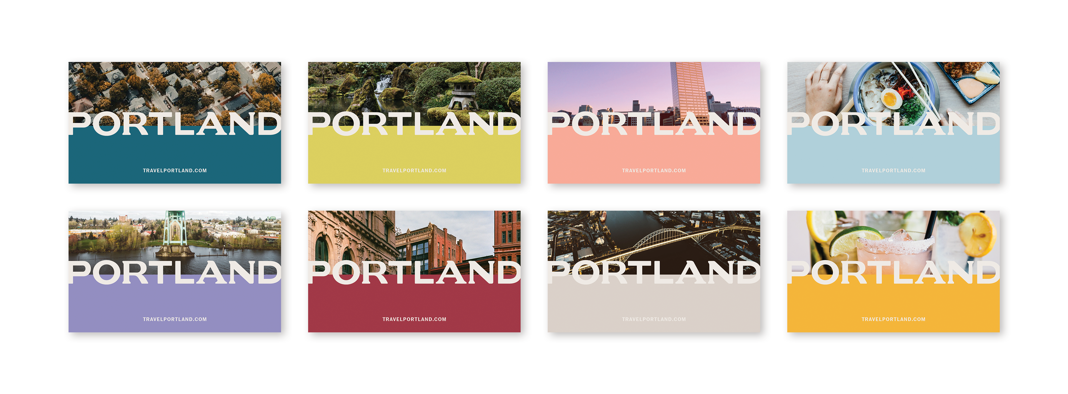
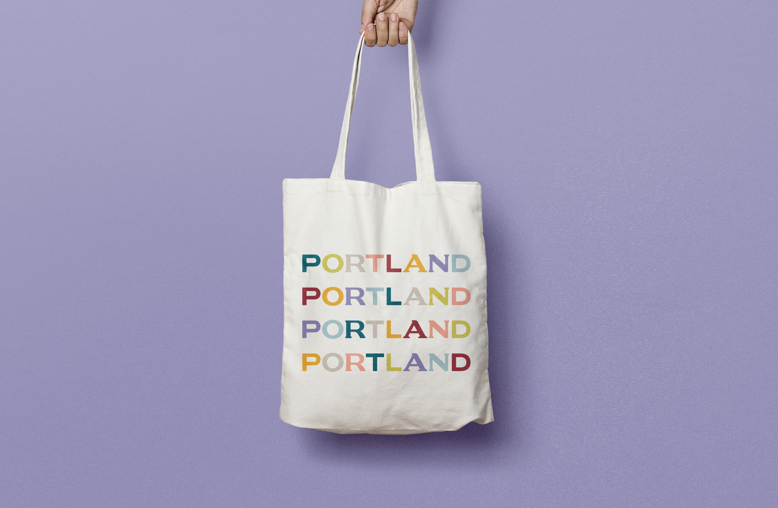
The logotype was crafted in homage to the unique neighborhoods and people of Portland. It reflects the unexpected and endearing character of the city. The rounded corners of the letterforms suggest an open-minded friendliness. The interplay between the serifs and sans serifs gives the mark a dynamic energy and speaks to the collaborative nature of Portlanders.
This new identity reflects Portland’s evolution from a provincial town to a bigger city with small-town vibes. Travel Portland doesn’t look, sound, or feel like a typical DMO. It stands in support of Portland, rather than the organization, and is focused on positioning Portland as a modern, global consumer brand.